
Related work
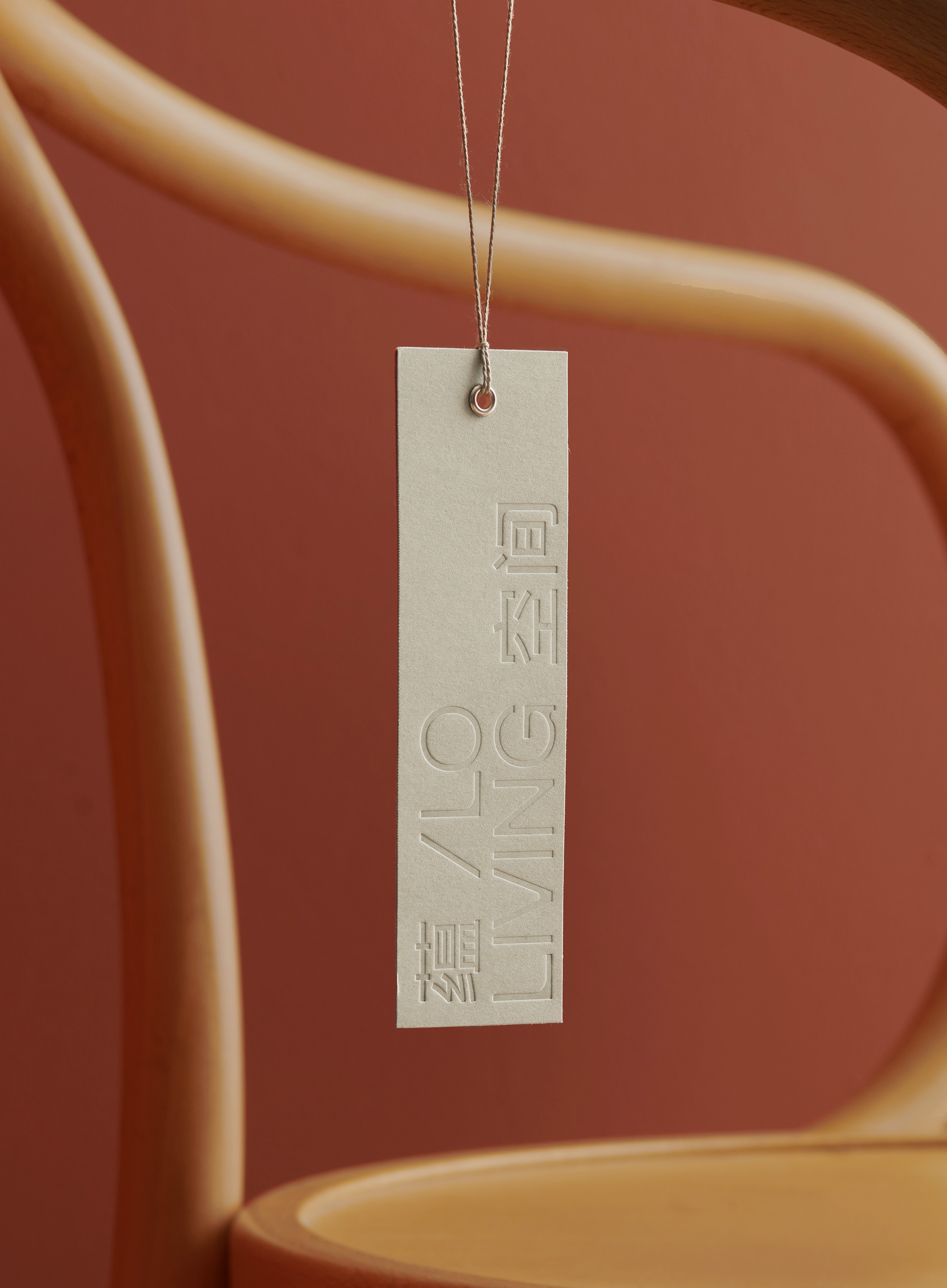
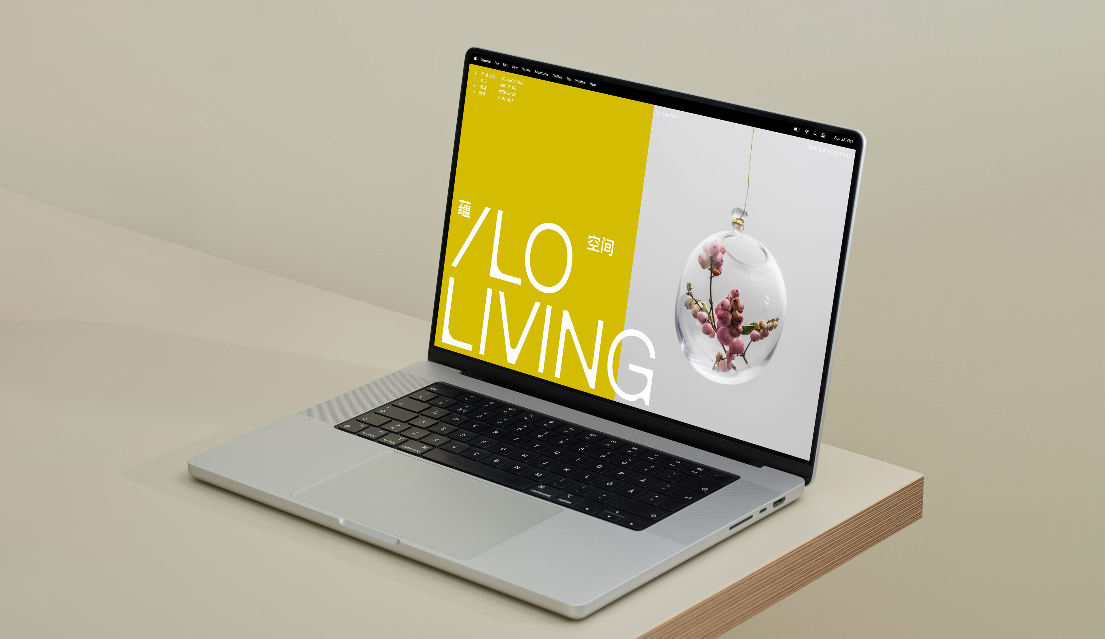
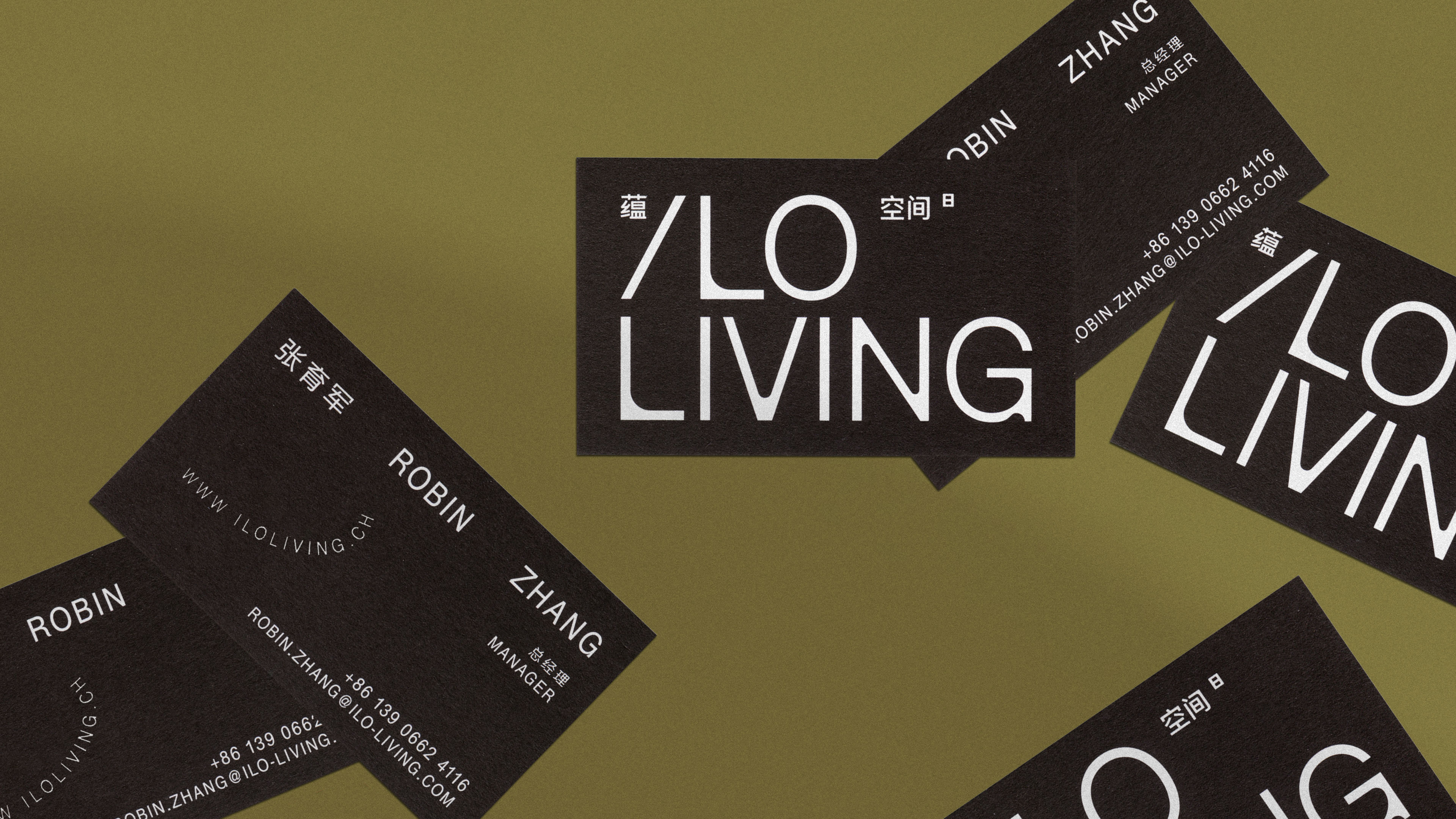
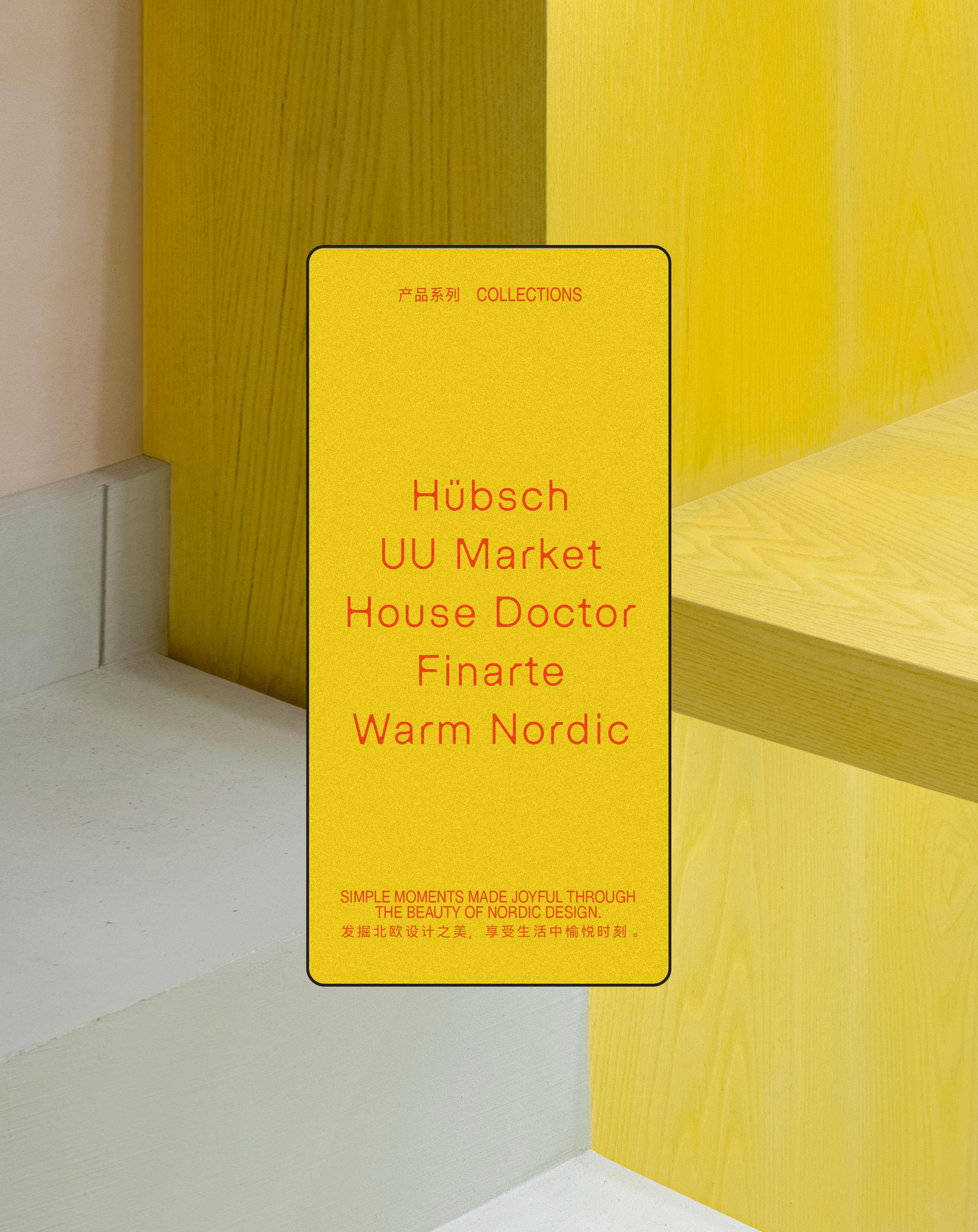
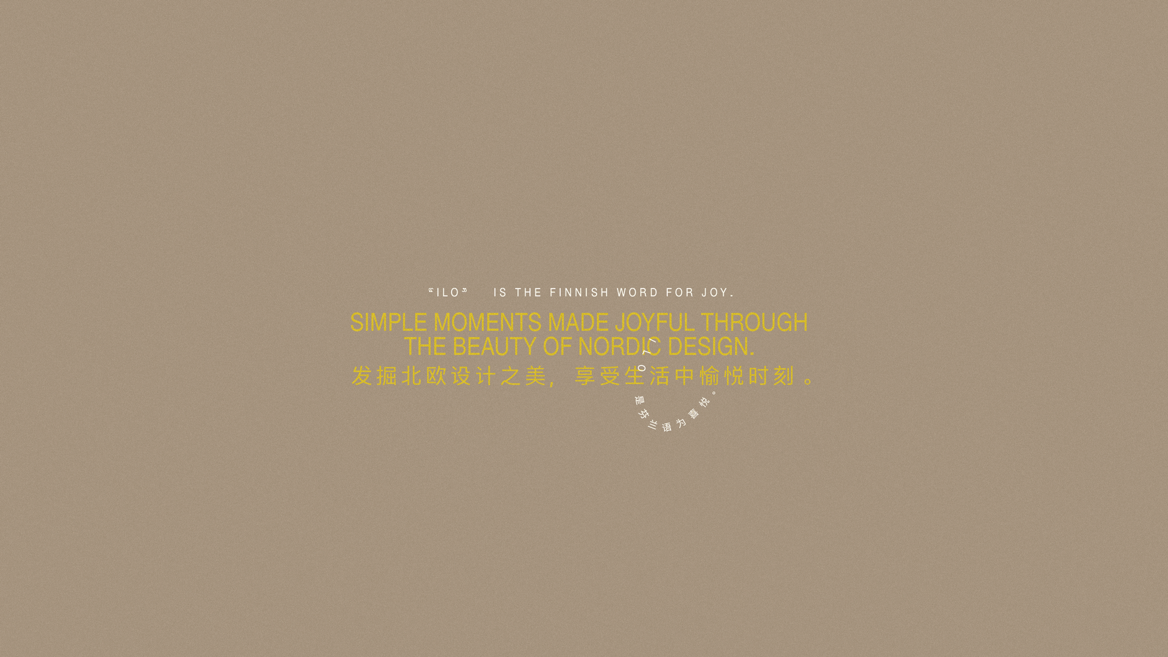
ILO Living is a Shanghai-based retail brand taking its name from the Finnish word for joy. It is founded on the principle of sharing and celebrating Nordic design and lifestyle. The brand’s first boutique and showroom can be found on Wukang Road, a popular shopping destination in Shanghai.
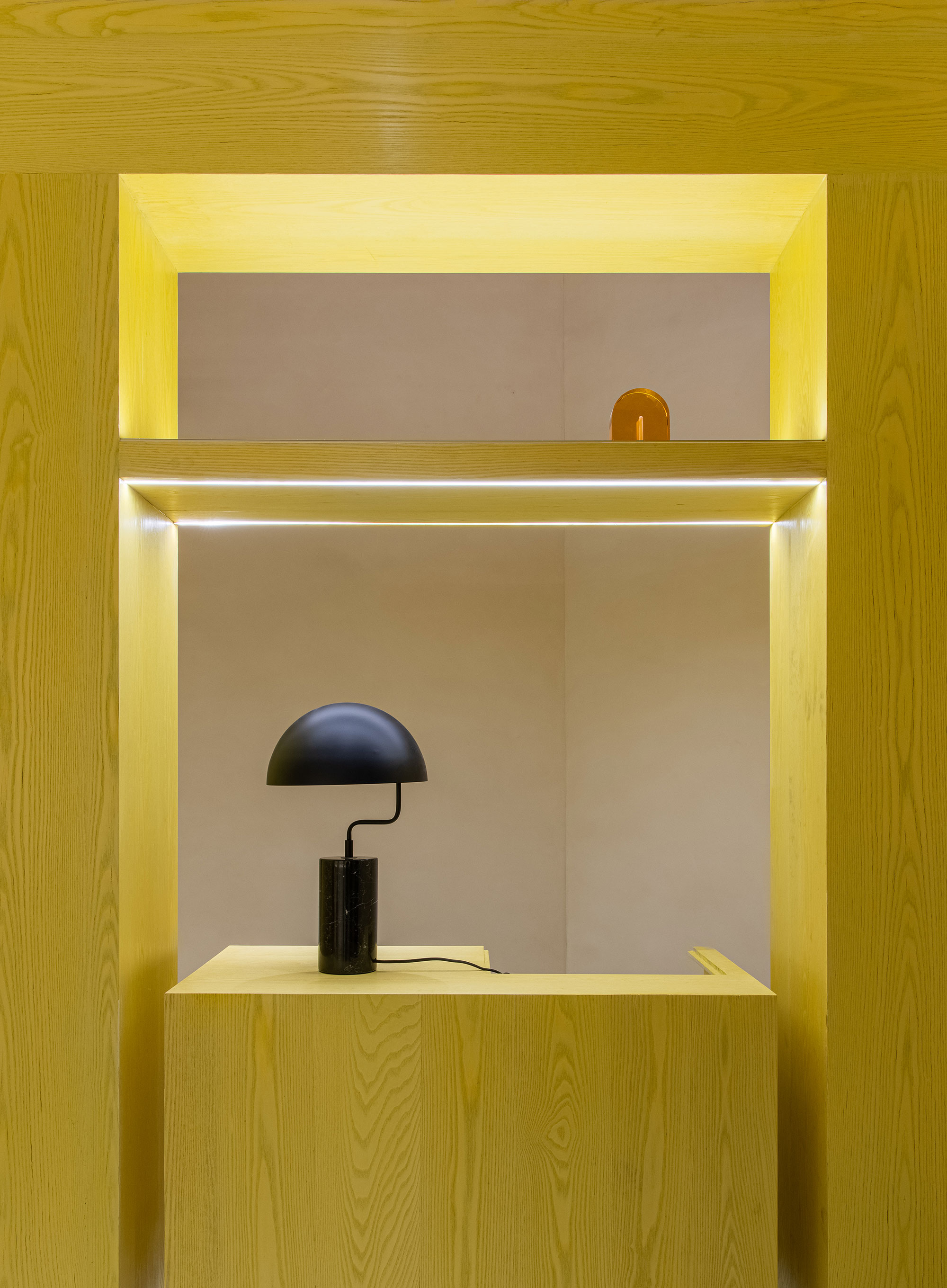
The aim was to create a contemporary and sleek, yet light-hearted and joyful visual identity that draws inspiration from the subtle Nordic warmth. The brand’s visual tone of voice was created in collaboration with Yatofu Creatives, who were also responsible for the interior design of the flagship store.
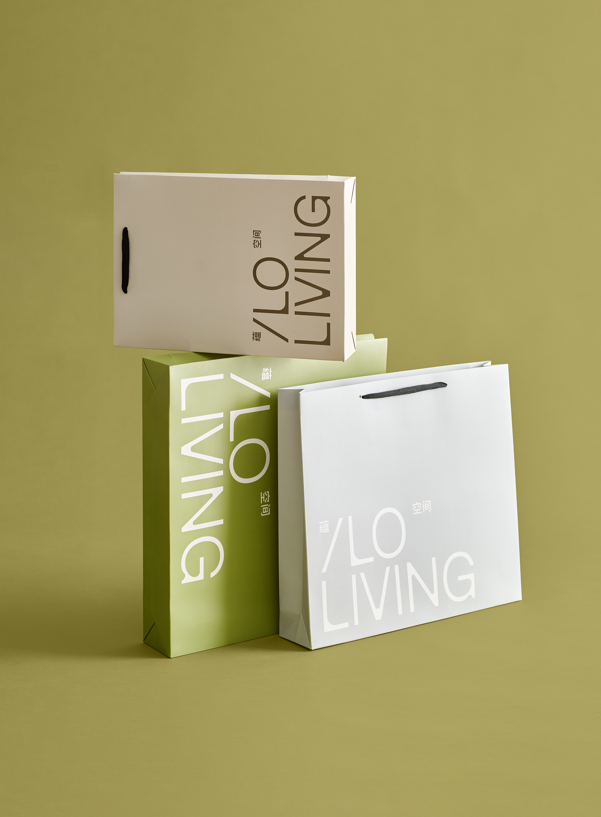
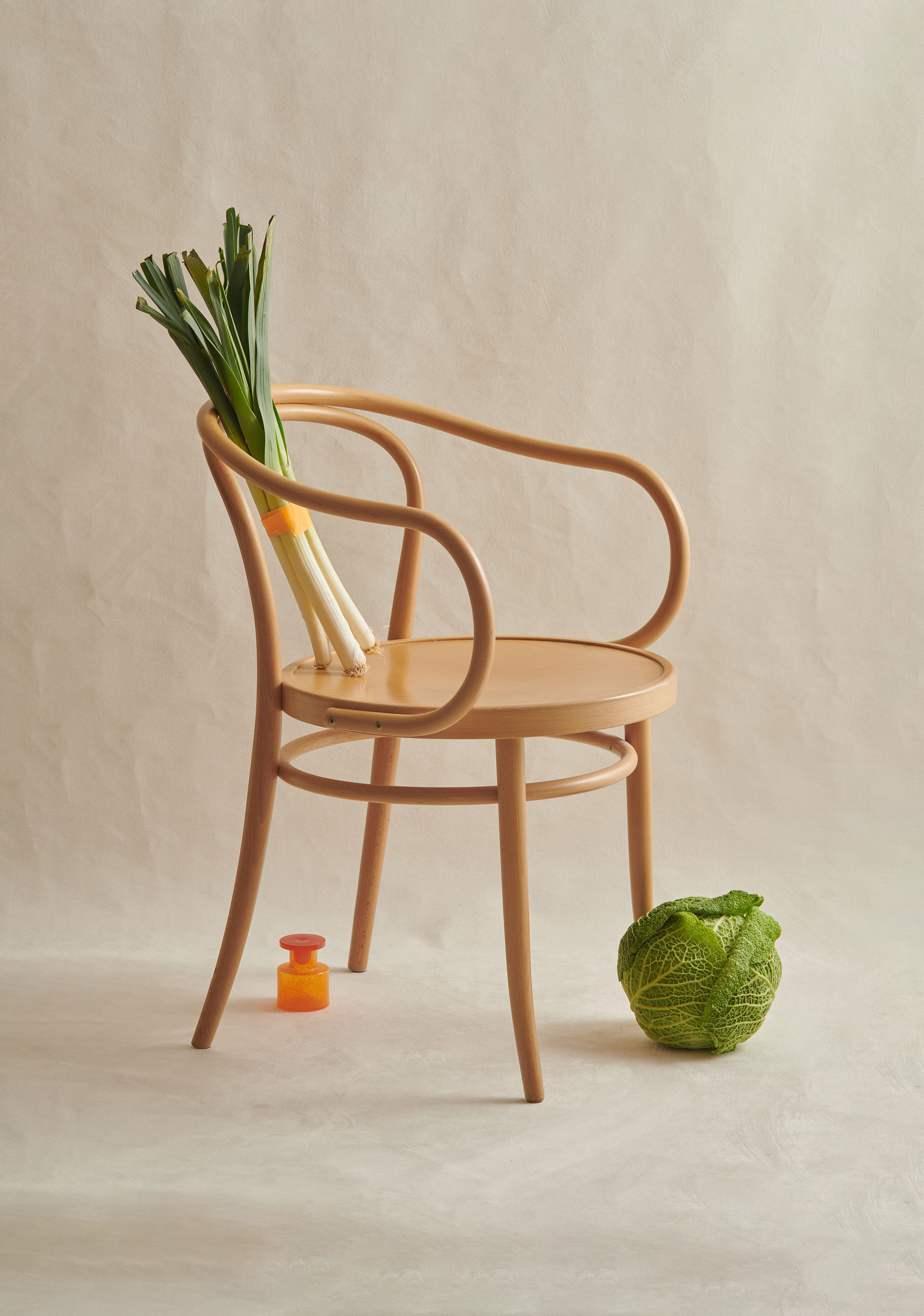
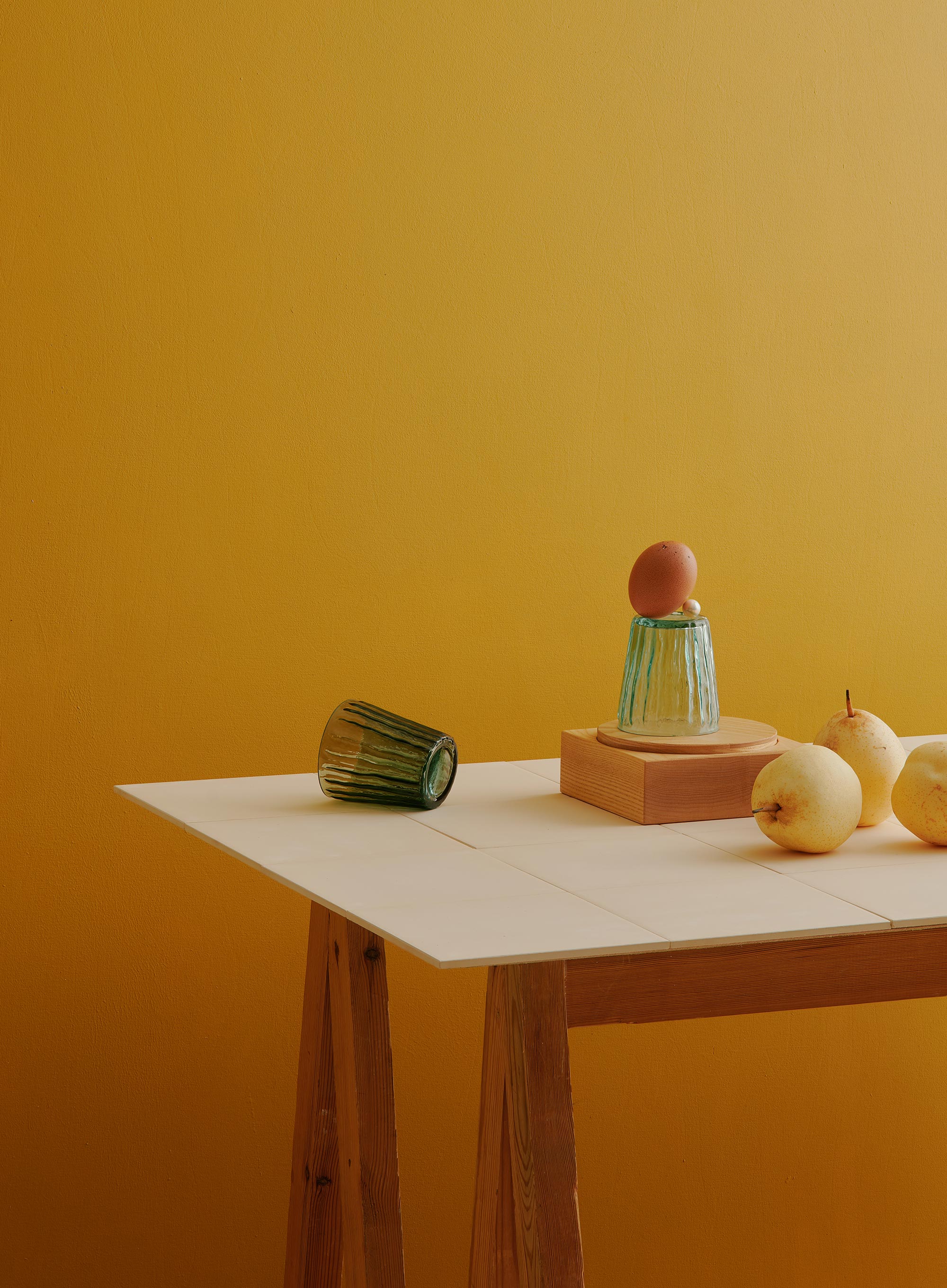
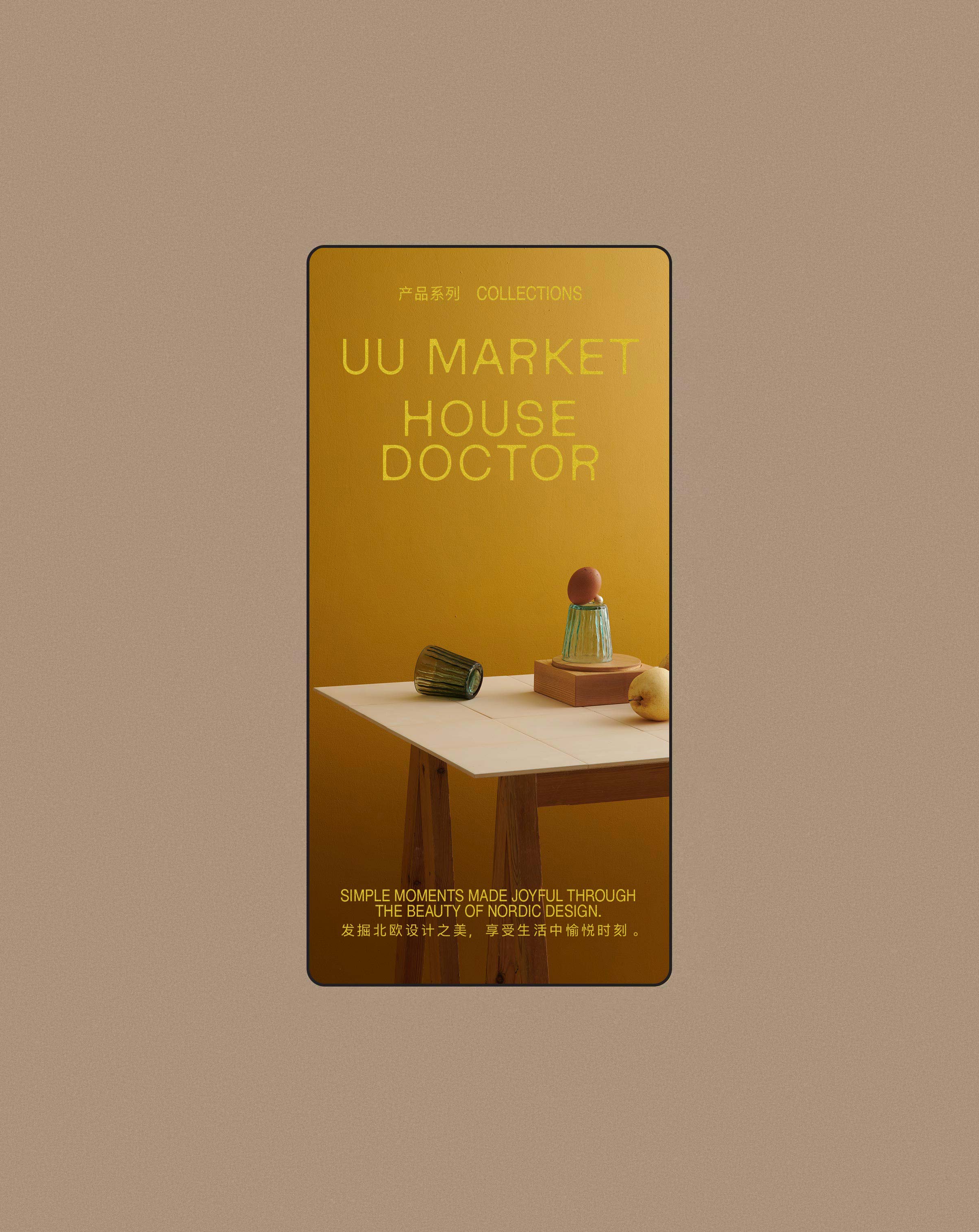
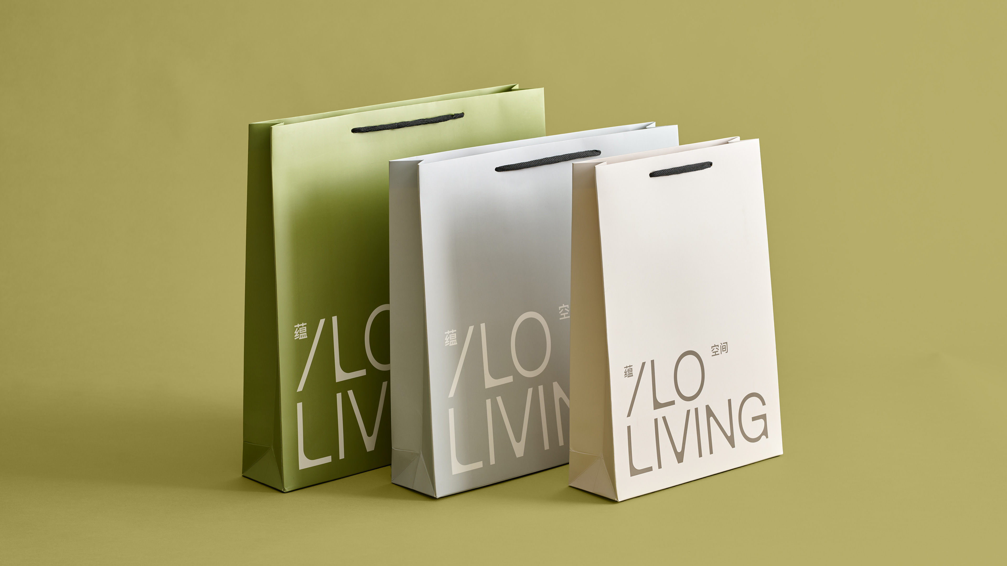
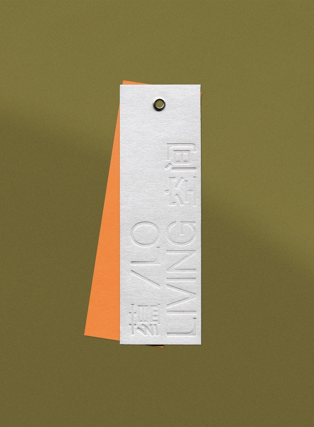
The visual identity relies on refined and understated expression referencing contemporary Nordic design, distilling a professional and up-to-date visuality. Simultaneously, ILO Living challenges industry conventions through the distinct and playful use of typographic details. The chosen colour palette also emphasises the brand’s dynamic and cheerful approach, contrasting the comfort of warm and natural materials with the energy of bold and vibrant hues.
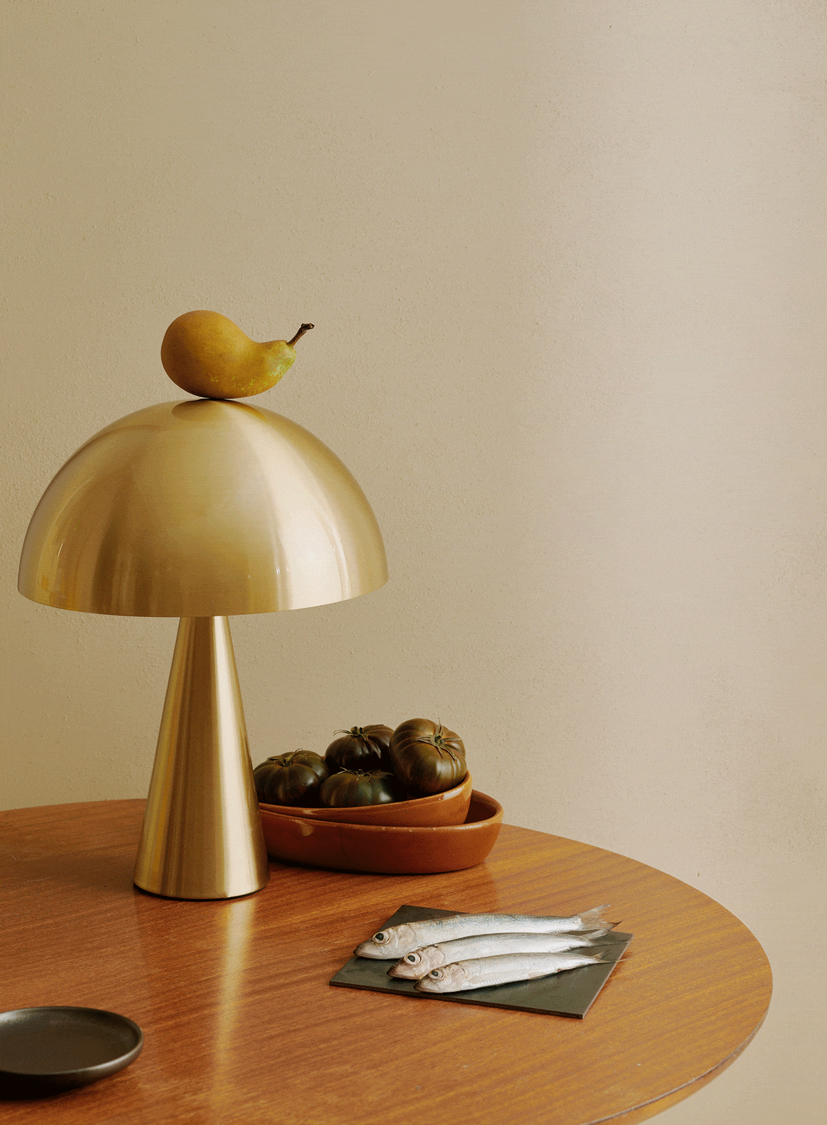
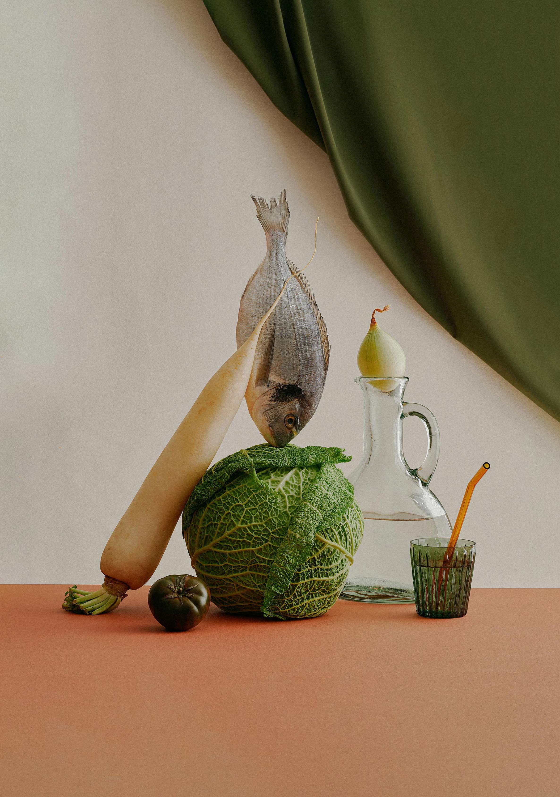
The carefully curated image world vocabulary elevates classic, familiar motifs in a sophisticated yet surprising fashion. The imagery highlights the beauty and joy found in the subtle details of the everyday, which captures the very essence of contemporary Nordic way of life.
Brand concept
done with YATOFU
Interior design
YATOFU
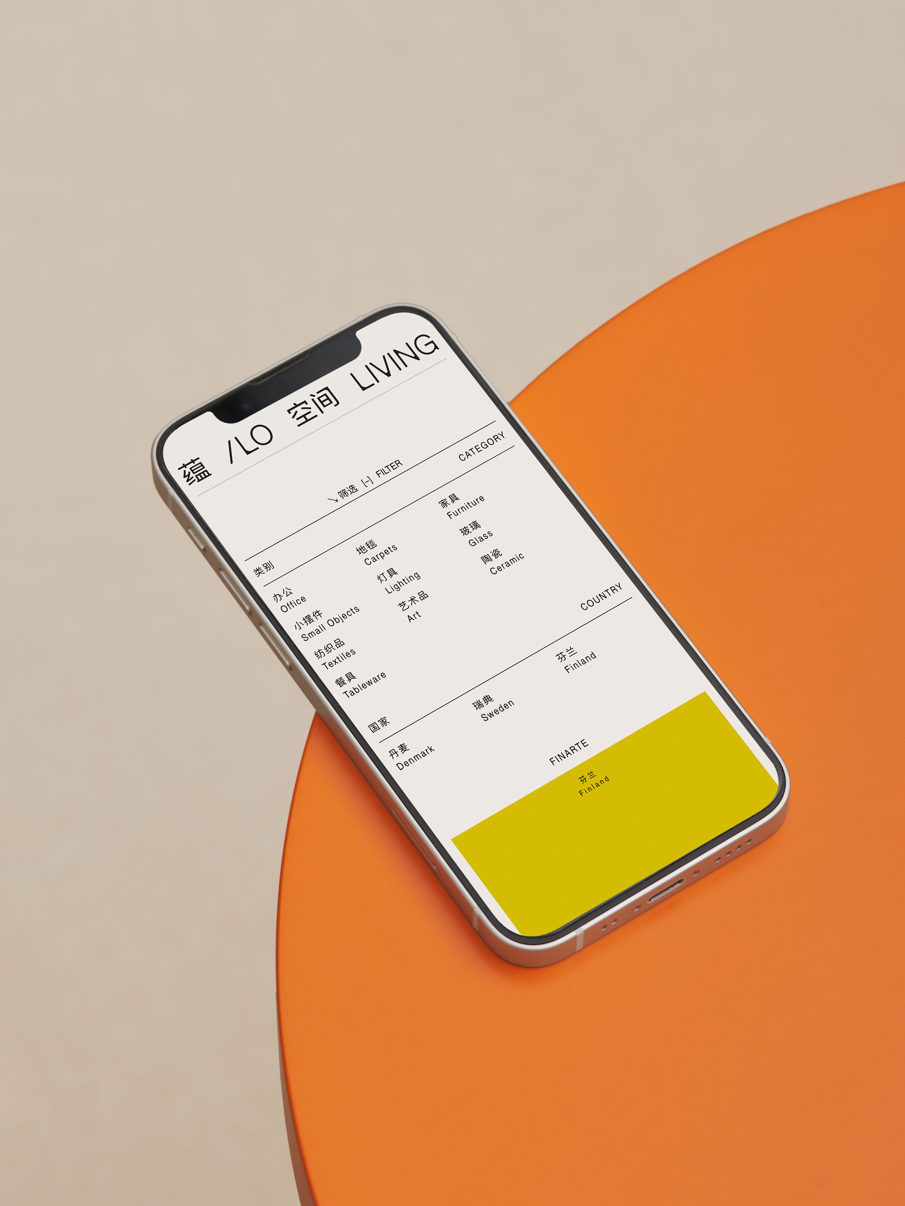
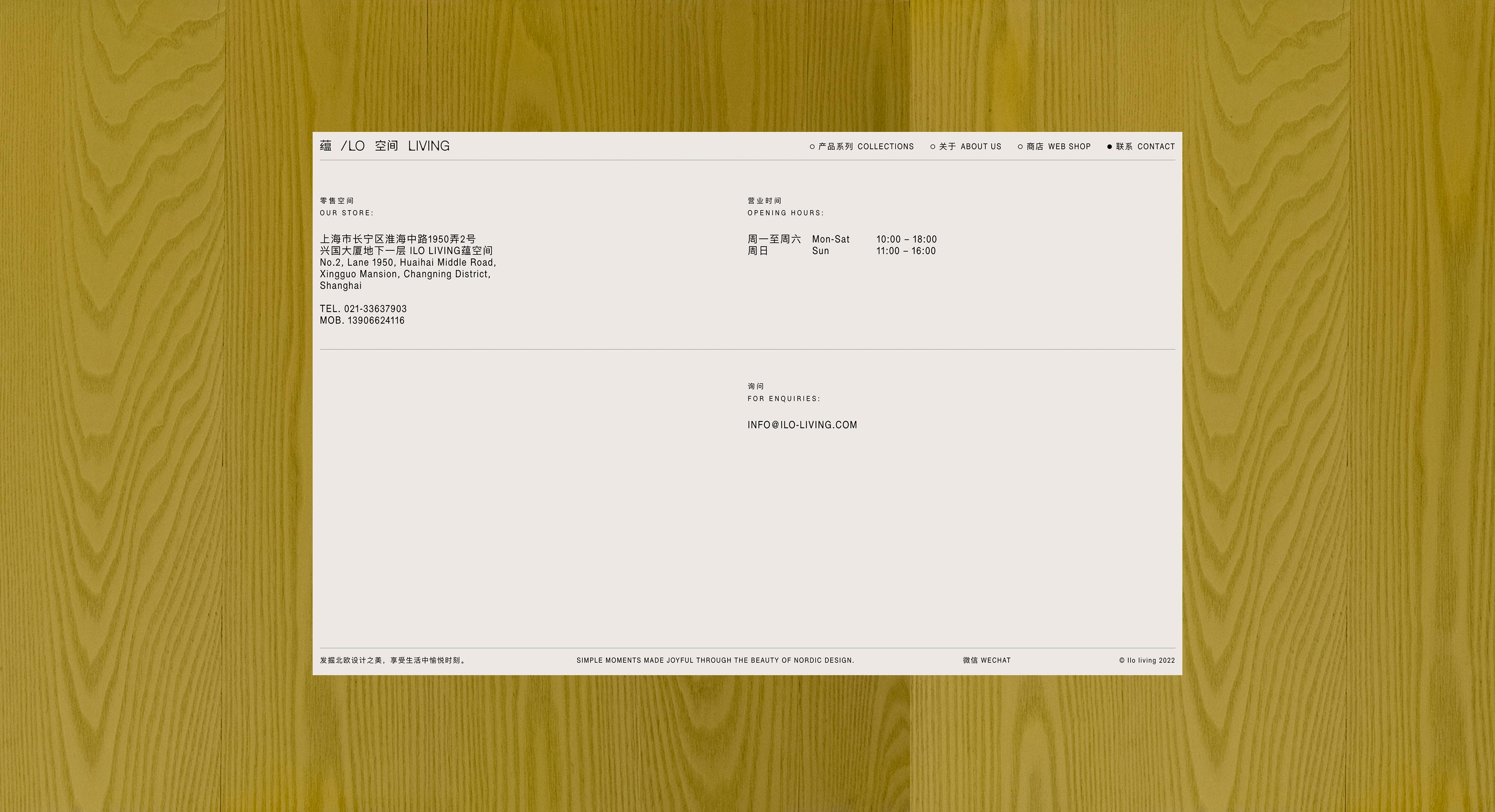
Web development
OPEN STATEMENT
Logo animation
OTSO REITALA
Imagery
(photography)
ALEKSI TIKKALA
(styling)
PIIA EMILIA
Fonts in use
[A.] HABEN GROTESK
by Pfa Typefaces
[B.] SCARLA
by Helsinki Type Studio
[C.] FINDER
by Black [Foundry]